Cell Customizers
# Cell Customizers
Cell customizers provide a flexible way to modify or entirely replace the controls used for rendering cells. Depending on the specific customization requirements, you can choose from various levels of customization to suit your needs.
# Bindings
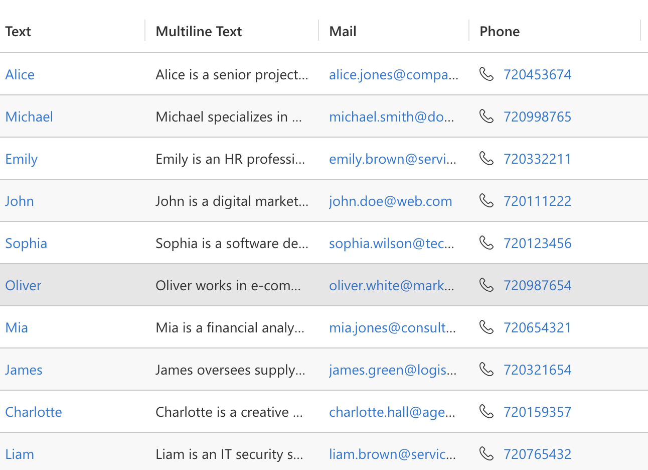
You can configure control bindings by assigning them to the controls array within a column definition. When using the native cell renderer, you have the option to set two bindings: PrefixIcon and SuffixIcon. These allow you to display an icon either before or after the cell value. Each binding accepts a stringified IIconProps (opens new window) object to define the icon properties.
{
  "name": "phone",
  "alias": "phone",
  "dataType": "SingleLine.Phone",
  "displayName": "Phone",
  "order": 0,
  "controls": [
    {
      "appliesTo": "renderer",
      "bindings": {
        "PrefixIcon": {
          "value": {
            "iconName": "Phone"
          },
          "type": "SingleLine.Text"
        }
      }
    }
  ]
}
2
3
4
5
6
7
8
9
10
11
12
13
14
15
16
17
18
19
20
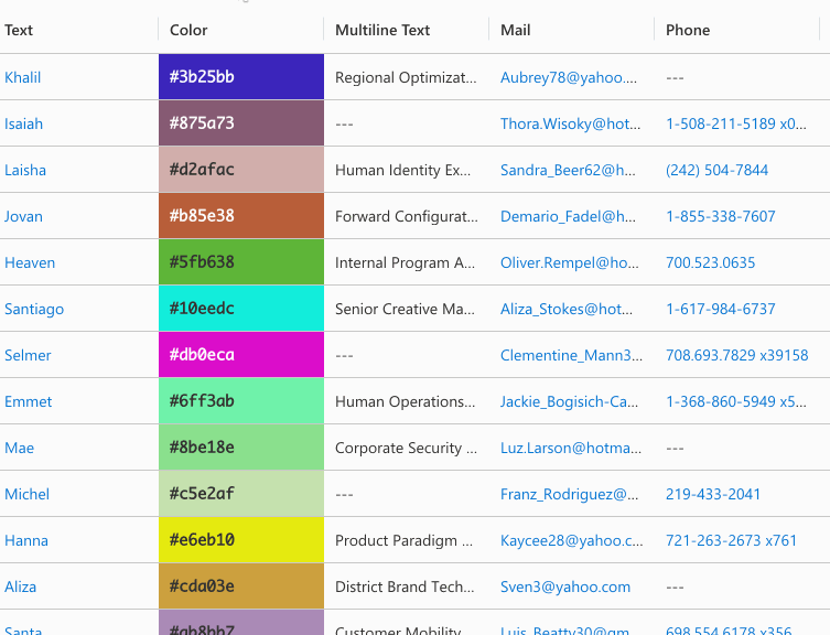
Column definition that adds Phone icon before cell's value.
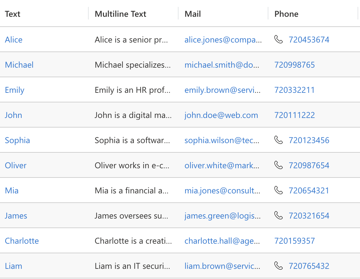
# Set bindings dynamically via expressions
For a more detailed and precise approach, you can utilize an expression to modify the bindings of a specific cell. Additionally, you can incorporate conditions to ensure that the bindings are applied only when certain criteria are satisfied.
const icon: IIconProps = {
  iconName: "Phone",
};
record.expressions.ui.setControlParametersExpression("phone", (defaultParameters) => {
    if (record.getValue("phone")?.includes("4")) {
      return {
        ...defaultParameters,
        PrefixIcon: {
          raw: JSON.stringify(icon),
        },
      };
    }
    return defaultParameters;
  }
);
2
3
4
5
6
7
8
9
10
11
12
13
14
15
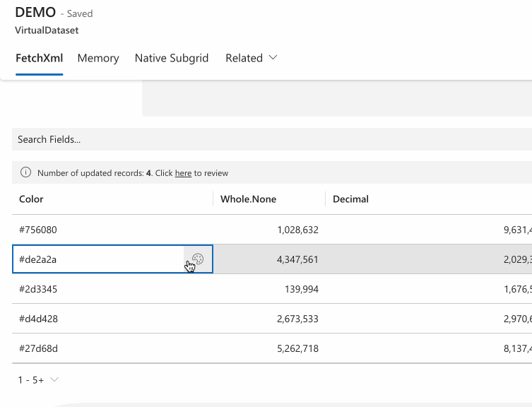
Expression above only appends the prefix if the phone number includes '4'.
# Column Alignment
You can change the content alignment of any column by setting it via column definition:
{
  "name": "talxis_wholenone",
  "visualSizeFactor": 100,
  "alignment": "center"
}
2
3
4
5
# Conditional Formatting
It is possible to change cell's look through conditional formatting. This is currently only supported through the custom formatting expression.
record.expressions.ui.setCustomFormattingExpression("color", () => {
  return {
    backgroundColor: record.getValue("color"),
    themeOverride: {
      fonts: {
        medium: {
          fontFamily: 'Consolas, monaco, monospace',
          fontWeight: 600,
        },
      },
    },
  };
});
2
3
4
5
6
7
8
9
10
11
12
13
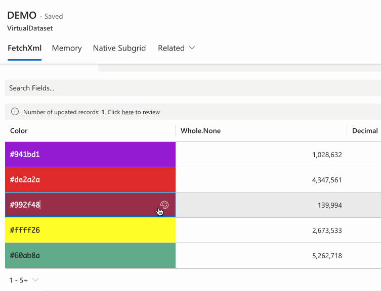
Expression above assigns the current color value as the cell background.
# Use custom PCF as cell control
It is possible to utilize field PCF controls as cell controls, provided they adhere to best practices and guidelines. To ensure eligibility for use as a cell control, your PCF must meet the following requirements:
user interface should always be rendered through
updateView, notinitinclude this piece of code on top of
initmethod:
(context as any).factory.fireEvent("onInit", this);
theming/styling should follow our theming guide (opens new window)
if used as a cell renderer (or editor with
oneClickEdit), the PCF must not trigger any asynchronous code when it gets loaded (including in theinitmethod). If your use case involves asynchronous operations, such as an API request, please refer to the async section of this guide.use latest version of Base Controls (opens new window)
Once your PCF meets these requirements, you can assign it to a column through the controls prop:
{
    "name": "talxis_singlelinetext",
    "displayName": "Color",
    "controls": [
      {
        "appliesTo": "editor",
        "name": "talxis_TALXIS.PCF.ColorPicker",
        //optionally pass values for static bindings
        "bindings": {}
      }
    ],
    "visualSizeFactor": 100
  }
2
3
4
5
6
7
8
9
10
11
12
13
The code snippet above specifies that the talxis_TALXIS.PCF.ColorPicker control should be utilized as the cell editor. For the cell renderer, it will continue to use the default native cell renderer. If you wish to use a custom PCF as cell renderer, please refer to this section of the guide.
Because the talxis_TALXIS.PCF.ColorPicker follows all of the guidelines, it works with other customizer features. For example, if we were to set conditional formatting and change the row height, the control will respect these settings:
record.expressions.ui.setCustomFormattingExpression("talxis_singlelinetext", () => {
  return {
    backgroundColor: record.getValue("talxis_singlelinetext"),
    themeOverride: {
      fonts: {
        medium: {
          fontFamily: 'Consolas, monaco, monospace',
          fontWeight: 600,
        },
      },
    },
  };
});
record.expressions.ui.setHeightExpression('talxis_singlelinetext', () => 50);
2
3
4
5
6
7
8
9
10
11
12
13
14
# Custom Ribbon PCF
Since Ribbon column is treated like any other column, you can also assign a custom PCF to it. This allows you to create unique Ribbon buttons that align with your specific requirements. You can either create a fuly custom UI or leverage the GridInlineRibbon Base Control to build upon the existing Ribbon UI.
{
    "name": "_talxis_gridRibbonButtons",
    "dataType": "SingleLine.Text",
    "controls": [
      {
        "appliesTo": "renderer",
        "name": "talxis_TALXIS.PCF.CustomRibbonDemo",
        "bindings": {
        }
      }
    ]
  }
2
3
4
5
6
7
8
9
10
11
12
Custom Ribbon Column Definition
public updateView(context: ComponentFramework.Context<IInputs>): void {
    ReactDOM.render(
        React.createElement(GridInlineRibbon, {
            context: context,
            parameters: {
                Record: context.parameters.Record,
                CommandButtonIds: context.parameters.CommandButtonIds,
                Dataset: context.parameters.Dataset
            },
            onOverrideComponentProps: (props) => {
                return {
                    onRender: (props, defaultRender) => {
                        return defaultRender({
                            ...props,
                            onRenderRibbon: (props, defaultRender) => {
                                return defaultRender({
                                    ...props,
                                    onRenderCommandBar: (props, defaultRender) => {
                                        if (context.parameters.Type?.raw === 'custom') {
                                            return React.createElement(CustomButtons, {
                                                context: context,
                                                items: props.items
                                            });
                                        }
                                        return defaultRender({
                                            ...props,
                                            items: props.items.map((item) => {
                                                return {
                                                    ...item,
                                                    iconProps: {},
                                                    className: mergeStyles({
                                                        '.ms-Button-label': {
                                                            fontWeight: 600
                                                        }
                                                    }),
                                                    text: `${this._getEmojiFromString(item.text!)} ${item.text}`,
                                                };
                                            })
                                        });
                                    }
                                });
                            }
                        });
                    }
                };
            }
        } as IGridInlineRibbon),
        this._container
    );
}
2
3
4
5
6
7
8
9
10
11
12
13
14
15
16
17
18
19
20
21
22
23
24
25
26
27
28
29
30
31
32
33
34
35
36
37
38
39
40
41
42
43
44
45
46
47
48
49
50
Rendering of Custom Ribbon
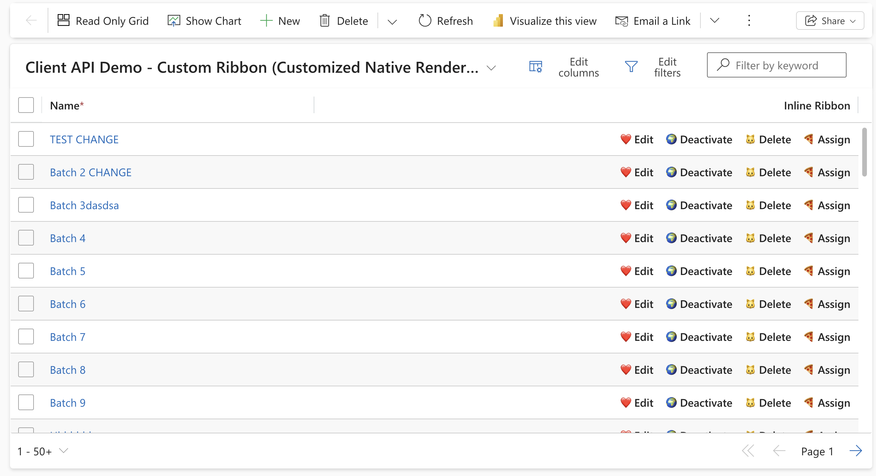 Customized native grid renderer
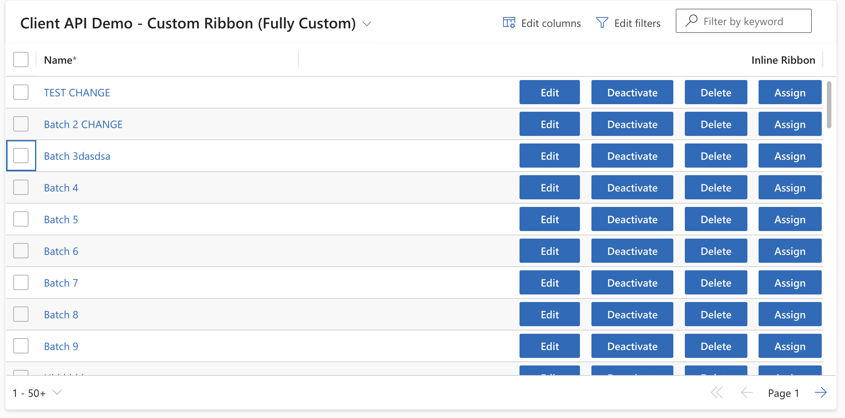 Fully custom Ribbon PCF
# Default Bindings
When the PCF is rendered as cell control, it will always receive these bindings in PCF context:
| Property | Description |
|---|---|
value | Bound attribute containing the cell value. If the custom PCF has a differently named binding, you will receive the value in that binding as well. |
Dataset | Dataset instance |
Record | Record instance |
Column | Column associated with the record |
EnableNavigation | Whether the control instance supports navigating to other pages. |
ColumnAlignment | How the control content should be aligned |
IsPrimaryColumn | Whether the column is marked as primary |
ShowErrorMessage | Decides if the control should display its own error messages for native errors. For example, if a user inputs an invalid value (e.g., a string in a number field), the platform (Form, Grid) should show the error message, not the control itself. In this case, the parameter will be false to tell the control it should not display the error message that comes with the bound attribute. |
CellType | Determines whether the control is being used as a Cell Editor or Cell Renderer |
AutoFocus | Whether the control should set focus on itself once it renders. |
IsInlineNewEnabled | Whether new records can be created from the control. (Lookup only) |
EnableTypeSuffix | Whether the data type related suffix should be displayed, such as an icon for a Phone field. |
EnableOptionSetColors | Whether the control should display option set value colors (OptionSet only) |
ShouldUnmountWhenOutputChanges | Whether the control will unmount once a value is outputed |
The PCF will also receive isControlDisabled within context.mode. It's value depends on the control's role:
- Set to
trueif the control is a cell renderer. - Set to
falseif the control is a cell editor.
# Theming in pop-ups
Controls often use modals, callouts, and other pop-ups to display additional UI elements. However, applying a cell-specific theme to these components can sometimes lead to undesirable results. For instance, in the example above, we apply a background color to the input field. If we were to extend this theme to the entire control, the callout for selecting colors would also inherit this background, which is not desired.
To address this, we provide the applicationTheme within the fluentDesignLanguage prop. This theme aligns with the global theme used across the environment. By wrapping your pop-ups in applicationTheme, you ensure they blend with the rest of the UI.
const theme = useControlTheme(context.fluentDesignLanguage);
const calloutTheme = props.context.fluentDesignLanguage?.applicationTheme ?? theme;

<Callout
  target={`#${buttonId}`}
  theme={calloutTheme}
  onDismiss={() => setIsCalloutVisible(false)}
  setInitialFocus
>
  <ThemeProvider theme={calloutTheme}>
    <ColorPicker
      color={value ?? ""}
      onChange={onColorChangeHandler}
      alphaType="none"
      showPreview={true}
      strings={{
        hueAriaLabel: "Hue",
      }}
    />
  </ThemeProvider>
</Callout>;
2
3
4
5
6
7
8
9
10
11
12
13
14
15
16
17
18
19
20
21
Snippet from talxis_TALXIS.PCF.ColorPicker showcasing wrapping of Callout for picking colors within applicationTheme if available.
# Optimizing PCF performance for Cell Renderer
When using a PCF control as a cell renderer, ensuring a fast render cycle is critical for optimal performance. To achieve this, your PCF should avoid rendering resource-intensive elements, such as input fields, and instead focus on lightweight components like simple text and icons.
To improve performance and speed up development, you can leverage the native cell renderer in your custom PCF. You can access it via the GridCellRenderer Base Control. It’s designed with performance in mind and you can simply customize it through the onOverrideComponentProps prop.
NOTE: The same concept applies to cell editors. Each native editor is managed through a Base Control, which you can utilize and tailor within your editor PCF. For instance,
talxis_TALXIS.PCF.ColorPickerleverages theTextFieldBase Control and customizes it to suit it's needs.
# Asynchronous code in Cell Renderer
A PCF control used as a cell renderer or editor with oneClickEdit should not contain async code like API requests when it loads. Multiple control instances firing requests at once could overload the server and hurt performance. Instead, fetch all data for the controls in one request using the onNewDataLoaded event, which triggers when new records are loaded into the Dataset. After fetching, rerender the Dataset control and pass your PCF the data with setControlParametersExpression.
const cache = new MemoryCache<string>();

this._dataset.addEventListener("onNewDataLoaded", async () => {
  cache.clear();
  const currentPageRecordIds: string[] = [];
  Object.values(this._dataset.records).map((record) => {
    currentPageRecordIds.push(record.getRecordId());
  });
  await new Promise((resolve) => {
    //this set timeout mock async operation like an API call,
    //you should ideally use one API call to get results for all records on page
    setTimeout(() => {
      currentPageRecordIds.map((id) => {
        cache.set(
          id,
          `${id}_async value_page_${this._dataset.paging.pageNumber}!`
        );
      });
      resolve(undefined);
    }, 5000);
  });
  this._dataset.render();
});

this._dataset.addEventListener("onDatasetDestroyed", () => {
  cache.clear();
});

this._dataset.addEventListener("onRecordLoaded", (record) => {
  record.expressions.ui.setControlParametersExpression(
    "talxis_singlelinetext",
    (defaultParameters) => {
      const data = cache.get(record.getRecordId());
      if (!data) {
        return defaultParameters;
      }
      return {
        ...defaultParameters,
        Data: {
          raw: data,
        },
      };
    }
  );
  record.expressions.ui.setLoadingExpression("talxis_singlelinetext", () => {
    if (!cache.get(record.getRecordId())) {
      return true;
    }
    return false;
  });
  record.expressions.ui.setLoadingExpression("talxis_singlelinetext", () => {
    if (!cache.get(record.getRecordId())) {
      return true;
    }
    return false;
  });
});
2
3
4
5
6
7
8
9
10
11
12
13
14
15
16
17
18
19
20
21
22
23
24
25
26
27
28
29
30
31
32
33
34
35
36
37
38
39
40
41
42
43
44
45
46
47
48
49
50
51
52
53
54
55
56
57
The code snippet above retrieves asynchronous data whenever new records are loaded into the page. It incorporates a loading expression to ensure the PCF only initializes once the data is fully available, eliminating the need to manage the loading state within the PCF itself
Once the PCF gets loaded, it can retrieve the data from Data parameter:
public updateView(context: ComponentFramework.Context<IInputs>): void {
    this._context = context;
    this._container.innerHTML = context.parameters.Data.raw;
}
2
3
4
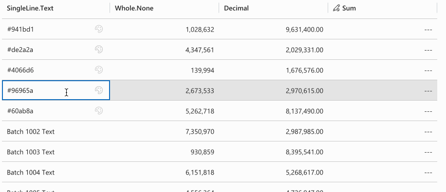
# Set controls dynamically via expressions
It is possible to assign controls to specific cells by using an expression:
record.expressions.ui.setCustomControlsExpression( "talxis_singlelinetext", (defaultControls) => {
    if (record.getValue("talxis_singlelinetext")?.startsWith("#")) {
      return [
        {
          appliesTo: "both",
          name: "talxis_TALXIS.PCF.ColorPicker",
        },
      ];
    }
    return defaultControls;
  }
);
2
3
4
5
6
7
8
9
10
11
12
Code snippet above returns the talxis_TALXIS.PCF.ColorPicker if the cell value startsWith with "#". Otherwise it will return the default controls.