Client Extensibility
# Client Extensibility
The control's functionality can be extended through client-side API access. This API allows interaction with the dataset instance, enabling event handler registration, interceptors setup, and record expression definitions for dynamic cell behavior. In order to utilize the client API, you need to configure the ClientApiWebresourceName and ClientApiFunctionName bindings to point to a script and function that will be invoked during control initialization (this is usually the same script you would use for the form OnLoad (opens new window) event). The specified function receives parameters containing the dataset instance and unique control ID, allowing you to manipulate the control and register event handlers.
function onDatasetControlInitialized(parameters) {
    const { controlId, dataset } = parameters;

    dataset.addEventListener('onRecordLoaded', (record) => {
        //register record expressions
     })
    dataset.addEventListener('onDatasetItemOpened', (entityReference) => {
        openAlertDialog(entityReference);
    });
    dataset.addEventListener('onRecordsSelected', (ids) => {
        showSelectedRecordsNotifications(ids, dataset)
    });
}
2
3
4
5
6
7
8
9
10
11
12
13
NOTE: For TypeScript implementations, use Dataset typings (
IDataset,IRecord) from@talxis/client-libraries. Avoid using properties/methods not defined in typings to prevent compatibility issues with PCF updates.
# Interceptors
Interceptors enable modification of specific control calls without altering core logic. Use the setInterceptor method on the dataset instance with two parameters: interceptor name and callback function. The callback receives original parameters and a proceed callback, allowing parameter modification or complete behavior override. Return types must match the original function signature.
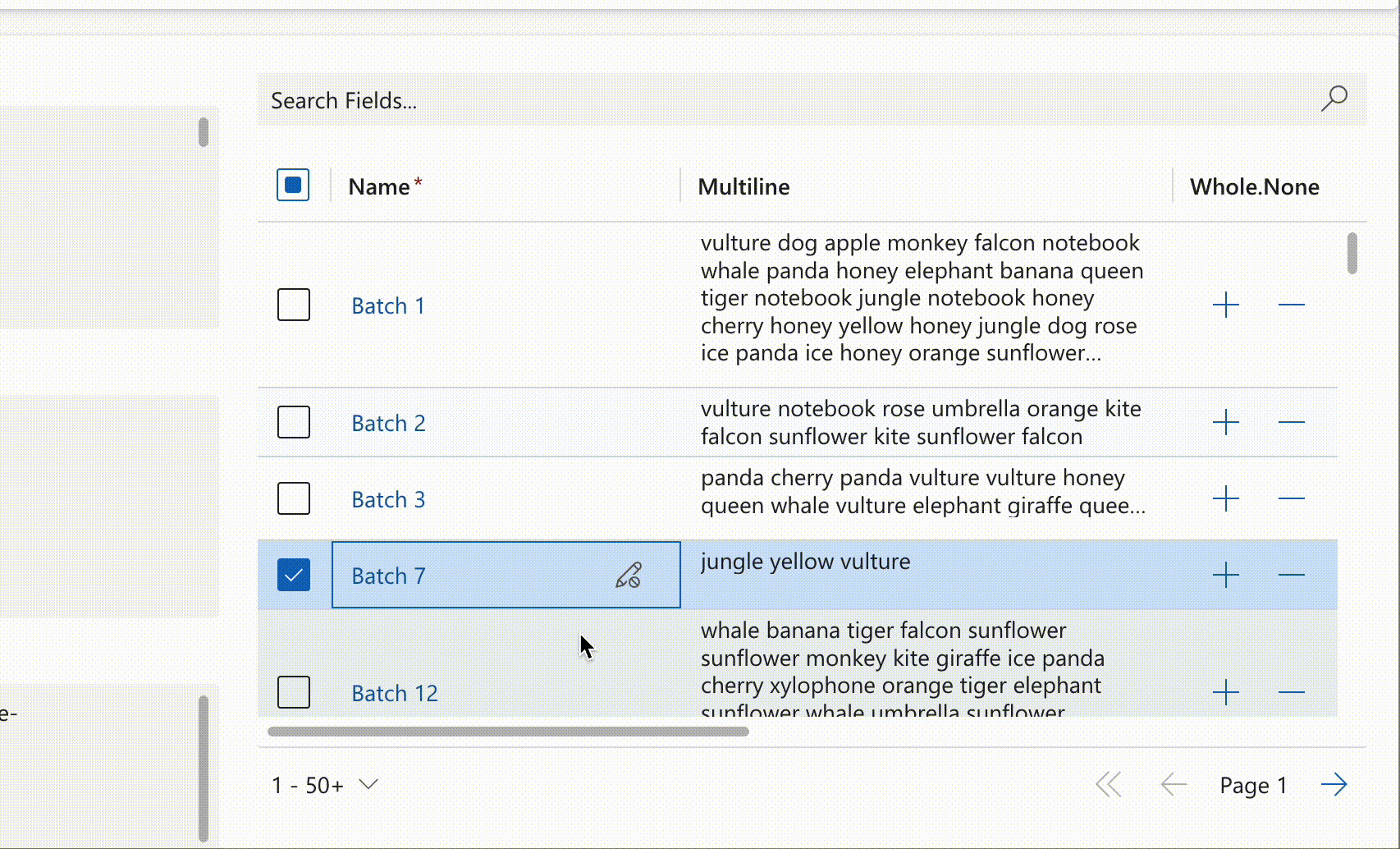
# Columns
Intercept column calls to modify resulting columns while maintaining control over column definitions. This interceptor ensures customizations persist even when other features (e.g., "Edit Columns") use setColumns. The interceptor triggers on every dataset column request, providing final control over column configuration.
dataset.setInterceptor('columns', (columns, defaultAction) => {
    const columnsMap = new Map(columns.map(column => [column.name, column]));
    const heightColumn = columnsMap.get('height');
    if (!heightColumn) {
        return columns;
    }
    columnsMap.set(heightColumn.name, {
        ...heightColumn,
        displayName: 'Height [cm]'
    });
    return [...columnsMap.values()];
})
2
3
4
5
6
7
8
9
10
11
12
The example demonstrates dynamic display name modification for the height column to include unit information.
NOTE: Never mutate the columns array directly. Always create a new array. Using
Mapis the recommended approach.
# onFirstDataLoad
Intercept the dataset's initial data load to execute custom logic before rendering. Useful for data fetching or calculations prior to user presentation. This interceptor requires a promise return value, maintaining the control's loading state until promise resolution.
dataset.setInterceptor('onFirstDataLoad', async (parameters, defaultAction) => {
    //perform some custom logic here
    const dataSource = await fetchDataSource();
    //make the dataset use the fetched data source
    dataset.setDataSource(data);
});
2
3
4
5
6
# onOpenDatasetItem
Intercept dataset item opening to execute custom logic before item access. Enables validation, logging, or complete behavior override by omitting the defaultAction callback.
dataset.setInterceptor('onOpenDatasetItem', (entityReference, defaultAction) => {
    //perform some custom logic here
    logOpening(entityReference);
    //proceed with the original opening behavior
    return defaultAction(entityReference);
});
2
3
4
5
6
# onRecordSave
Intercept record saving to execute validation or modification logic before persistence. Enables complete save behavior override by omitting the defaultAction callback.
dataset.setInterceptor('onRecordSave', (record, defaultAction) => {
    //perform some custom logic here
    if (!validateRecord(record)) {
        return {
            recordId: record.getRecordId(),
            success: false,
            errors: [{ message: 'Record is not valid!' }]
        }
    }
    //proceed with the original saving behavior
    return defaultAction(record);
});
2
3
4
5
6
7
8
9
10
11
12
# onRetrieveRecordCommand
Intercept ribbon button retrieval to add custom buttons or modify existing ones.
dataset.setInterceptor("onRetrieveRecordCommand", async (options, defaultAction) => {
    const commands = await defaultAction(options);
    const topButton = {
      canExecute: true,
      commandButtonId: "Custom.Button",
      shouldBeVisible: true,
      tooltip: "Custom Button",
      commandId: "Custom.Command",
      label: "Custom Button",
      //fluent ui icon or svg web resource are supported
      icon: "Heart",
      children: [],
      controlType: "",
      execute: () => alert("Custom Button clicked!"),
    };
    const inlineButton = {
      canExecute: true,
      commandButtonId: "CustomInline.Button",
      shouldBeVisible: true,
      tooltip: "Custom Button",
      commandId: "CustomInline.Command",
      label: "Custom Inline Button",
      //fluent ui icon or svg web resource are supported
      icon: "Heart",
      children: [],
      controlType: "",
      execute: () => alert("Custom Inline Button clicked!"),
    };
    return [...(!options.isInline ? [topButton] : [inlineButton]), ...commands];
  },
);
2
3
4
5
6
7
8
9
10
11
12
13
14
15
16
17
18
19
20
21
22
23
24
25
26
27
28
29
30
31
NOTE: When adding inline buttons (
options.isInline = true), include the button ID in theInlineRibbonButtonIdscontrol parameter for proper display.
# Record Expressions
Record expressions enable dynamic cell manipulation within records through event-driven callback functions. Each expression targets a specific record cell. The API supports the following expression types:
# Cell Values
Defines dynamic cell values similar to Excel formulas. Unlike setValue, this callback doesn't trigger dataset changes or display pending modifications. User-entered values take precedence over expressions until removed, after which expressions resume control.
dataset.addEventListener('onRecordLoaded', (record) => {
//value of this cell will always be the sum of talxis_decimal and
//talxis_wholenone
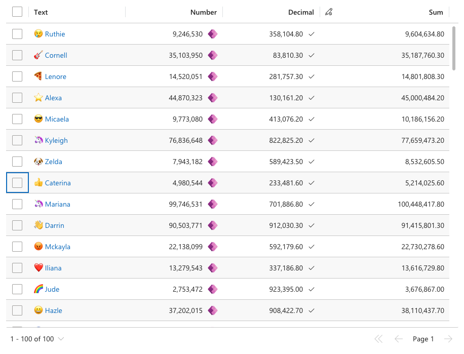
record.expressions?.setValueExpression('talxis_sum__virtual', () => {
const value1 = record.getValue('talxis_decimal') ?? 0;
const value2 = record.getValue('talxis_wholenone') ?? 0;
return value1 + value2;
})
})
2
3
4
5
6
7
8
9
NOTE: Avoid calling
getValueon the same record and cell during value calculation to prevent infinite loops.
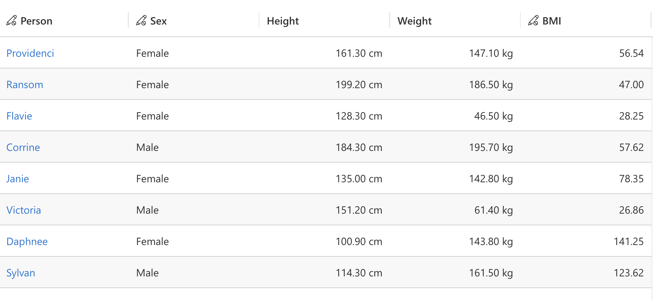
# Formatted Cell Values
Customizes cell display formatting while preserving underlying values. Enables unit appending or other formatting enhancements for improved clarity.
record.expressions.setFormattedValueExpression("height", (defaultFormattedValue) => {
    if (!defaultFormattedValue) {
      return defaultFormattedValue;
    }
    return `${defaultFormattedValue} cm`;
  }
);
record.expressions.setFormattedValueExpression("weight", (defaultFormattedValue) => {
    if (!defaultFormattedValue) {
      return defaultFormattedValue;
    }
    return `${defaultFormattedValue} kg`;
  }
);
2
3
4
5
6
7
8
9
10
11
12
13
14
15
# Cell Validation
Implements custom validation logic alongside native validation. Failed custom validation prevents save operations and displays custom error messages in the interface.
dataset.addEventListener('onRecordLoaded', (record) => {
    //validation for this cell will fail if it's value is <= 0
    record.expressions?.setValidationExpression('talxis_sum__virtual', () => {
        const value = record.getValue('talxis_sum__virtual') ?? 0;
        return {
            error: value <= 0,
            errorMessage: value <= 0 ? 'Has to be positive number!' : ''
        }
    })
})
2
3
4
5
6
7
8
9
10
# Cell Disabling
Controls cell-level editing when EnableEditing and IsValidForUpdate are enabled. Disabled expressions override default editability for specific cells based on custom logic.
record.expressions?.setDisabledExpression('talxis_name', () => {
    //disable editing if the value ends with '7'
    if (record.getValue('talxis_name')?.endsWith('7')) {
        return true;
    }
    return false;
})
2
3
4
5
6
7
# Cell Control Parameters
Customize cell control parameters for specific requirements. Native cell renderers support optional PrefixIcon and SuffixIcon parameters accepting stringified IIconProps (opens new window) objects for icon customization. Each data type offers specific parameters; for example, Lookup controls support savedquery retrieval method modification.
record.expressions.ui.setControlParametersExpression("decimal", (defaultParameters) => {
    return {
      ...defaultParameters,
      SuffixIcon: {
        raw: JSON.stringify({
          iconName: "CheckMark",
        }),
      },
    };
  }
);
record.expressions.ui.setControlParametersExpression("number", (defaultParameters) => {
    return {
      ...defaultParameters,
      SuffixIcon: {
        raw: JSON.stringify({
          imageProps: {
            src: "https://img.icons8.com/?size=512&id=OU2ddOKw840K&format=png",
          },
        }),
      },
    };
  }
);
2
3
4
5
6
7
8
9
10
11
12
13
14
15
16
17
18
19
20
21
22
23
24
# Cell Loading
Controls cell loading state display during asynchronous operations or value calculations.
dataset.addEventListener('onRecordLoaded', (record) => {
    //will put all cells into a loading state.
    for (const column of dataset.columns) {
        record.expressions?.ui.setLoadingExpression(column.name, () => {
            return true;
        })
    }
})
2
3
4
5
6
7
8
# Cell Notifications
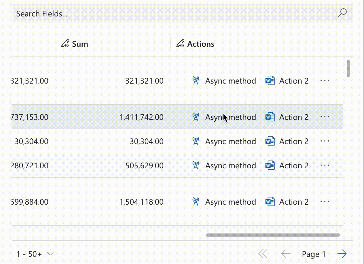
Enhance cells with interactive buttons supporting single or multiple actions. Single-action buttons execute immediately, while multi-action buttons display selection menus. Notifications can be assigned to virtual columns to create inline ribbons.
record.expressions?.ui.setNotificationsExpression('talxis_name', () => {
    return [{
            uniqueId: 'action1',
            iconName: 'LightningBolt',
            text: 'Single Action',
            actions: [{
                actions: []
            }]
        },
        {
            uniqueId: 'action2',
            iconName: 'LightningBolt',
            text: 'Two Actions',
            messages: ['Choose one of the following actions:'],
            actions: [{
                message: 'Action 1',
                actions: [() => alert('Action 1')]
            }, {
                message: 'Action 2',
                actions: [() => alert('Action 2')]
            }]
        },
        {
            uniqueId: 'action3',
            iconName: 'LightningBolt',
            text: 'Multiple Actions',
            messages: ['Choose one of the following actions:'],
            actions: [{
                    message: 'Action 1',
                    actions: [() => alert('Action 1')]
                }, {
                    message: 'Action 2',
                    actions: [() => alert('Action 2')]
                },
                {
                    message: 'Action 3',
                    actions: [() => alert('Action 3')]
                }, {
                    message: 'Action 4',
                    actions: [() => alert('Action 4')]
                }
            ]
        }
    ];
})
2
3
4
5
6
7
8
9
10
11
12
13
14
15
16
17
18
19
20
21
22
23
24
25
26
27
28
29
30
31
32
33
34
35
36
37
38
39
40
41
42
43
44
45
Notifications extend control functionality through interactive elements such as counters, as demonstrated below:
record.expressions?.ui.setNotificationsExpression('talxis_wholenone', () => {
    return [{
            uniqueId: 'increment',
            iconName: 'Add',
            buttonProps: {
                iconOnly: true
            },
            text: 'Increment',
            actions: [{
                actions: [() => {
                    const value = record.getValue(columnName) ?? 0;
                    record.setValue(columnName, value + 1);
                    dataset.render();
                }]
            }]
        },
        {
            uniqueId: 'decrement',
            iconName: 'Remove',
            buttonProps: {
                iconOnly: true
            },
            text: 'Decrement',
            actions: [{
                actions: [() => {
                    const value = record.getValue(columnName) ?? 0;
                    record.setValue(columnName, value - 1);
                    dataset.render();
                }]
            }]
        }
    ];
})
2
3
4
5
6
7
8
9
10
11
12
13
14
15
16
17
18
19
20
21
22
23
24
25
26
27
28
29
30
31
32
33
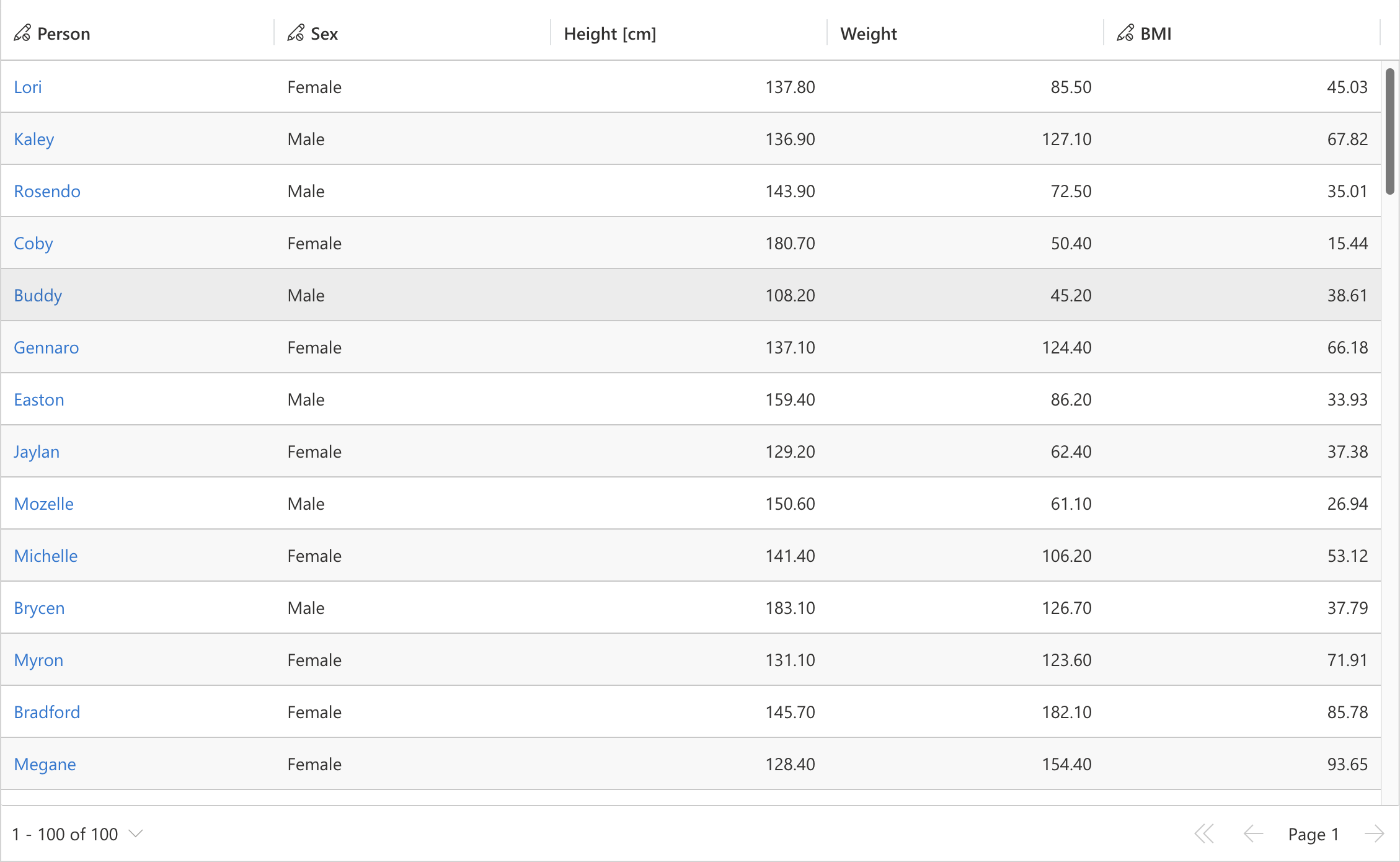
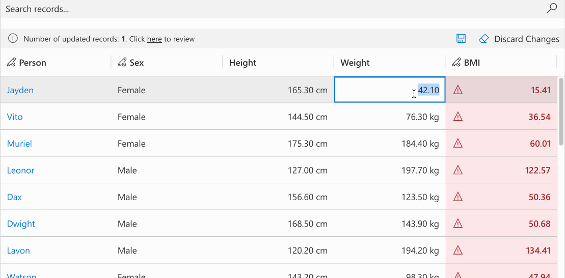
# Conditional Formatting
Apply condition-based cell styling with customizable primary, background, or text colors. Colors can be set individually with automatic calculation of remaining properties for consistency. The optional themeOverride parameter enables detailed theme customization. Derive colors from defaultCellTheme to maintain design consistency.
//calculating the formatting for bmi field based the bmi value
record.expressions.ui.setCustomFormattingExpression('bmi', (defaultTheme) => {
    const bmi = record.getValue('bmi');
    let backgroundColor = undefined;
    let textColor = undefined;
    switch (true) {
        case bmi <= 18.5:
            backgroundColor = defaultTheme.semanticColors.errorBackground;
            textColor = defaultTheme.semanticColors.errorText;
            break;

        case bmi <= 25.0:
            backgroundColor = defaultTheme.semanticColors.successBackground;
            textColor = defaultTheme.semanticColors.successIcon;
            break;

        case bmi <= 30.0:
            backgroundColor = defaultTheme.semanticColors.warningBackground;
            textColor = defaultTheme.semanticColors.messageText;
            break;

        default:
            backgroundColor = defaultTheme.semanticColors.errorBackground;
            textColor = defaultTheme.semanticColors.errorText;
    }
    return {
        backgroundColor: backgroundColor,
        textColor: textColor,
        themeOverride: {
            fonts: {
                medium: {
                    fontWeight: 600
                }
            }
        }
    }
})
2
3
4
5
6
7
8
9
10
11
12
13
14
15
16
17
18
19
20
21
22
23
24
25
26
27
28
29
30
31
32
33
34
35
36
37
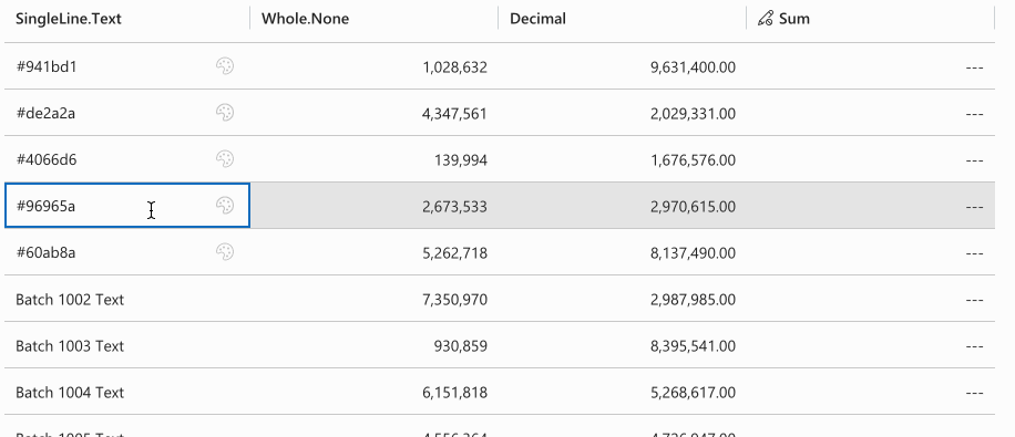
# Custom Controls
Assign custom PCF controls to specific cells. For detailed information, see the cell customizer section.
record.expressions.ui.setCustomControlsExpression( "talxis_singlelinetext", (defaultControls) => {
    if (record.getValue("talxis_singlelinetext")?.startsWith("#")) {
      return [
        {
          appliesTo: "both",
          name: "talxis_TALXIS.PCF.ColorPicker",
        },
      ];
    }
    return defaultControls;
  }
);
2
3
4
5
6
7
8
9
10
11
12
Returns talxis_TALXIS.PCF.ColorPicker for cell values starting with "#", otherwise returns default controls.