Virtual Dataset
# Virtual Dataset
# Overview
Virtual Dataset binds Grid controls to custom data sources through two data providers: Memory and FetchXml. The Memory Provider uses in-memory data collections, while the FetchXml Provider retrieves data through FetchXml queries.
# Supported Features
Both providers support:
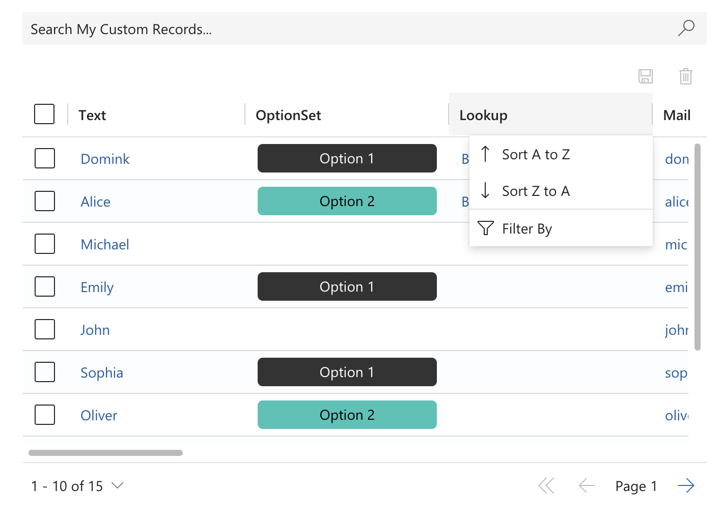
- Sorting
- Filtering
- Aggregations
- Grouping
- Paging
- Validation
- Editing (including linked entities)
- Row Selection
- Quick Find
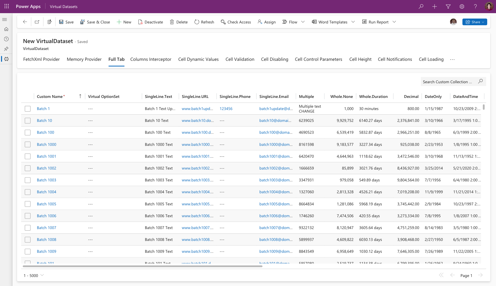
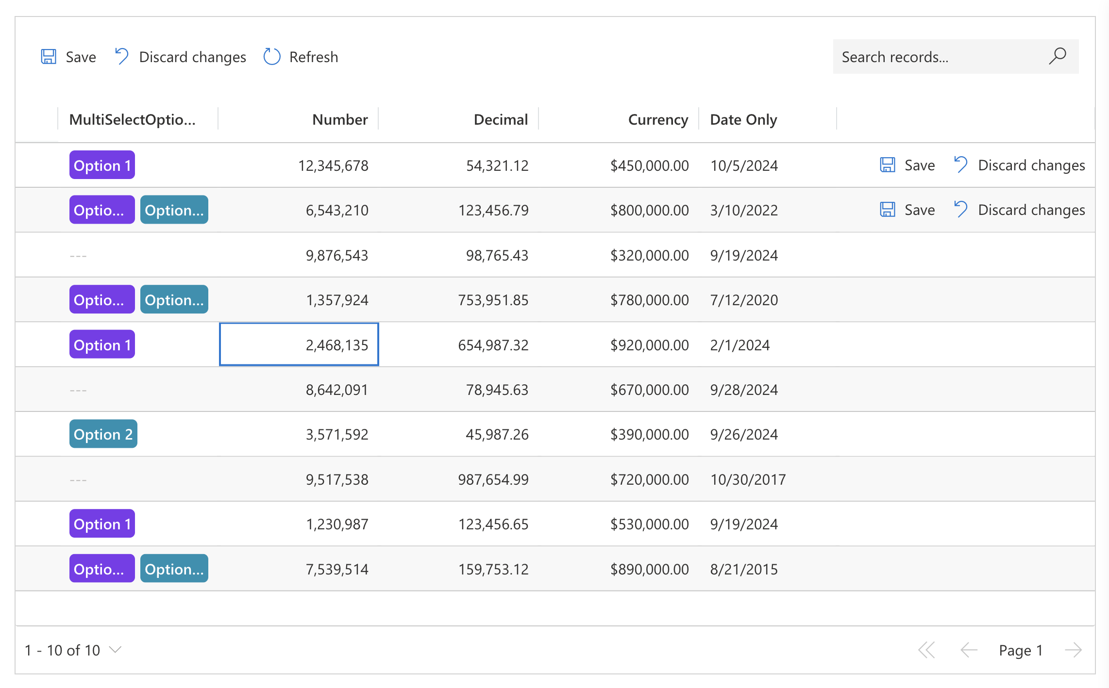
# Visual Example
# Data Providers
# FetchXml Provider
Uses FetchXml strings as the data source for retrieving data from Dataverse.
# Memory Provider
Uses stringified JSON arrays containing key-value pairs where keys represent column names and values represent column data. The data structure follows the OData response format:
- OptionSets use numeric values
- Lookups use GUIDs
- Other data types follow standard OData conventions
For correct value formatting, reference OData query responses for entities containing the required data types.
{
   "@odata.context":"https://devbox-1959.crm4.dynamics.com/api/data/v9.1/$metadata#talxis_fields",
   "value":[
      {
         "@odata.etag":"W/\"4363703\"",
         "talxis_file_name":null,
         "_owninguser_value":"e86450b3-5882-ef11-ac20-000d3abee5ab",
         "talxis_clientextensibilitydatasource":null,
         "talxis_singlelinetext":"Text",
         "talxis_clientextensibilitybindingfield":null,
         "talxis_name":"Batch 1",
         "talxis_dateandtime":"1972-01-15T00:00:00Z",
         "_transactioncurrencyid_value":"13292e9f-7881-ef11-ac21-000d3a2b5e17",
         "talxis_clientextensibilitymetadata":null,
         "exchangerate":1,
         "talxis_currency_base":998472,
         "talxis_singlelineemail":"test@test.cz",
         "versionnumber":4363703,
         "talxis_file":null,
         "talxis_singlelineurl":"https://www.seznam.cz",
         "talxis_image":null,
         "talxis_multiple":"Multiple Text",
         "statecode":0,
         "talxis_image_timestamp":null,
         "talxis_wholeduration":710135,
         "talxis_twooptions":true,
         "_createdonbehalfby_value":null,
         "utcconversiontimezonecode":null,
         "statuscode":1,
         "talxis_multiselectoptionsetcolorful":"742070000,742070001",
         "talxis_fetchxmlbindingfield":null,
         "talxis_memorybindingfield":null,
         "talxis_clientextensibilitycolumns":null,
         "talxis_optionsetcolorful":742070000,
         "modifiedon":"2024-10-12T10:34:53Z",
         "talxis_wholenone":991020,
         "talxis_image_url":null,
         "talxis_fetchxmldata":null,
         "_ownerid_value":"e86450b3-5882-ef11-ac20-000d3abee5ab",
         "talxis_fieldid":"6c9e8489-1086-ef11-ac21-6045bd91c897",
         "_owningteam_value":null,
         "_modifiedonbehalfby_value":null,
         "createdon":"2024-10-09T07:31:46Z",
         "talxis_twooptionscolorful":false,
         "talxis_imageid":null,
         "_owningbusinessunit_value":"551c1778-4881-ef11-ac21-000d3a2b5e17",
         "timezoneruleversionnumber":0,
         "talxis_dateandtimetzi":null,
         "talxis_multiselectoptionset":"742070000,742070001",
         "talxis_fetchxmlcolumns":null,
         "_createdby_value":"e86450b3-5882-ef11-ac20-000d3abee5ab",
         "talxis_fetchxmlentitymetadata":null,
         "talxis_singlelinephone":"123456789",
         "talxis_dateonly":"1968-09-02T00:00:00Z",
         "_talxis_parentfield_value":"ac6aa5c8-4086-ef11-ac21-000d3abee5ab",
         "_modifiedby_value":"e86450b3-5882-ef11-ac20-000d3abee5ab",
         "overriddencreatedon":null,
         "importsequencenumber":null,
         "talxis_decimal":2000000,
         "talxis_currency":998472,
         "talxis_memorydata":null,
         "talxis_optionset":742070000,
         "talxis_memorycolumns":null,
         "talxis_memoryentitymetadata":null
      }
   ]
}
2
3
4
5
6
7
8
9
10
11
12
13
14
15
16
17
18
19
20
21
22
23
24
25
26
27
28
29
30
31
32
33
34
35
36
37
38
39
40
41
42
43
44
45
46
47
48
49
50
51
52
53
54
55
56
57
58
59
60
61
62
63
64
65
66
67
# Lookup Columns
Lookup columns in Memory Provider require three properties:
_{lookupColumnName}_value: GUID identifying the lookup record. Used as the unique identifier within the dataset and integrates with the Dataset Client API. For user interactions with lookup records (e.g.,
onDatasetItemOpenedevent), this GUID appears in theentityReference.{lookupColumnName}@Microsoft.Dynamics.CRM.lookuplogicalname: Logical name corresponding to the record table in Dataverse. Can reference an existing Dataverse table (entity bound) or use an arbitrary string (virtual). Entity-bound lookups enable record searching and value editing. Add the logical name to the
Targetsmetadata property for full entity binding. Virtual lookups disable editing functionality._{lookupColumnName}_value@OData.Community.Display.V1.FormattedValue: Formatted value displayed to users.
Entity Bound Lookup Example:
{
   "name":"entityBoundLookup",
   "alias":"entityBoundLookup",
   "dataType":"Lookup.Simple",
   "displayName":"Entity Bound Lookup",
   "order": 0,
   "visualSizeFactor":150,
   "metadata":{
      "IsValidForUpdate": false,
      "Targets":[
         "account"
      ]
   }
}
2
3
4
5
6
7
8
9
10
11
12
13
14
Column Definition
[
   {
      "_entityBoundLookup_value":"ca07e627-5e00-4c4d-a7cf-8dcf0dd39437",
      "_entityBoundLookup_@Microsoft.Dynamics.CRM.lookuplogicalname":"account",
      "_entityBoundLookup_value@OData.Community.Display.V1.FormattedValue":"Account 1"
   }
]
2
3
4
5
6
7
8
9
Data Source
Virtual Lookup Example:
{
   "name":"virtualLookup",
   "alias":"virtualLookup",
   "dataType":"Lookup.Simple",
   "displayName":"Virtual Lookup",
   "order": 0,
   "visualSizeFactor":150,
   "metadata":{
      "IsValidForUpdate":true,
      "Targets":[
         "virtualEntity"
      ]
   }
}
2
3
4
5
6
7
8
9
10
11
12
13
14
Column Definition
[
   {
      "_virtualLookup_value":"f1c75b22-4c25-4019-91e0-2d55df6fed22",
      "_virtualLookup_@Microsoft.Dynamics.CRM.lookuplogicalname":"virtualEntity",
      "_virtualLookup_value@OData.Community.Display.V1.FormattedValue":"Virtual Entity 1"
   }
]
2
3
4
5
6
7
8
9
Data Source
# File and Image Columns
File and Image columns in Memory Provider require the following properties:
| Property | Description |
|---|---|
{fileColumnName} | Unique file identifier, can be any GUID. |
{fileColumnName.fileName} | Name of the file. |
{fileColumnName.filesizeinbytes} | Size of the file in bytes. |
{fileColumnName.mimetype} | Mimetype (opens new window) of the file. |
{fileColumnName.fileurl} | URL where the file can be downloaded from. |
{fileColumnName.thumbnailurl} | URL for a thumbnail preview of the image (required for image columns only). |
Memory Provider File and Image Example:
[
   {
      "name":"file",
      "alias":"file",
      "dataType":"File",
      "displayName":"File",
      "order":0,
      "visualSizeFactor":150,
      "metadata":{
         "IsValidForUpdate":true
      }
   },
   {
      "name":"image",
      "alias":"image",
      "dataType":"Image",
      "displayName":"Image",
      "order":0,
      "visualSizeFactor":150,
      "metadata":{
         "IsValidForUpdate":true
      }
   }
]
2
3
4
5
6
7
8
9
10
11
12
13
14
15
16
17
18
19
20
21
22
23
24
Column Definitions
{
   "file":"c3c9ffca-52e1-4c5b-a2ee-8520bec82544",
   "file.filename":"document_report_2025.pdf",
   "file.filesizeinbytes":902119,
   "file.mimetype":"application/pdf",
   "file.fileurl":"https://storage.example.com/files/docs/document_report_2025.pdf",
   "image":"439150e1-1ede-41e0-93bb-4da0b1e5254b",
   "image.filename":"sunset_landscape.jpg",
   "image.filesizeinbytes":902119,
   "image.mimetype":"image/jpeg",
   "image.fileurl":"https://storage.example.com/images/sunset_landscape.jpg",
   "image.thumbnailurl":"https://storage.example.com/images/thumbs/sunset_landscape_thumb.jpg"
}
2
3
4
5
6
7
8
9
10
11
12
13
14
Data Source
# Column Configuration
Columns are defined using a stringified JSON array in the Columns binding. Each object follows the PCF Dataset Column interface (opens new window) specification.
[
  {
    "name": "datetime",
    "alias": "datetime",
    "dataType": "DateAndTime.DateAndTime",
    "displayName": "Date Time",
    "order": 0,
    "visualSizeFactor": 300
  },
  {
    "name": "mail",
    "alias": "mail",
    "dataType": "SingleLine.Email",
    "displayName": "Mail",
    "order": 1,
    "visualSizeFactor": 300,
    "metadata": {
      "IsValidForUpdate": true
    }
  },
  {
    "name": "lookup",
    "alias": "lookup",
    "dataType": "Lookup.Simple",
    "displayName": "Lookup",
    "order": 2,
    "visualSizeFactor": 300,
    "metadata": {
      "Targets": ["customLookup"]
    }
  },
  {
    "name": "optionset",
    "alias": "optionset",
    "dataType": "OptionSet",
    "displayName": "OptionSet",
    "order": 3,
    "visualSizeFactor": 300,
    "metadata": {
      "OptionSet": [
        {
          "Color": "red",
          "Label": "Option 1",
          "Value": 1
        },
        {
          "Color": "blue",
          "Label": "Option 2",
          "Value": 2
        }
      ]
    }
  }
]
2
3
4
5
6
7
8
9
10
11
12
13
14
15
16
17
18
19
20
21
22
23
24
25
26
27
28
29
30
31
32
33
34
35
36
37
38
39
40
41
42
43
44
45
46
47
48
49
50
51
52
53
54
Note: Columns defined using
setColumnsin the Client API override configurations set in the Columns binding and provider defaults.
# Extended Properties
The native column interface includes additional properties:
| Property | Description |
|---|---|
type | Specifies whether the column contains data or serves other purposes (e.g., ribbon or notifications). The control adapts its behavior accordingly (e.g., excluding data-specific features like non-editable icons in headers). |
alignment | Column alignment. Numbers default to right-aligned, other types default to left-aligned if not specified. |
isDraggable | Allows users to customize the column position. |
oneClickEdit | Enables editing without double-clicking. Note: Enabling on many columns may reduce performance. |
controls | Used to set up cell customizers. |
autoHeight | Fits row height to cell content and allows manual adjustment. Defaults to true for multiline datatype columns. |
grouping | Configures the provider to group data by this column. |
aggregation | Configures the provider to aggregate values from this column. |
metadata | Defines or overrides Xrm Attribute Metadata (opens new window) for a column. |
# Provider-Specific Requirements
# Memory Provider
All columns must be explicitly defined in the Columns binding. Undefined columns will not appear in the grid. Each column requires at least the name and dataType properties.
Quick Find columns can be specified via Entity Metadata binding using the QuickFindColumns property. This contains a string array of column names for full text search. Without this property, search operates on the primary column. If no primary column exists, full text search is disabled.
{ "PrimaryIdAttribute": "id", "QuickFindColumns": ["email", "text"] }
Setting quick find on email and text columns.
If you wish to use Edit Columns feature with Memory Provider, you must specify all columns that can be added via Edit Columns through the SavedQueries prop in Entity Metadata binding.
{ "PrimaryIdAttribute": "id", "SavedQueries": [{
  "columns": [{
        "name": "text",
        "alias": "text",
        "dataType": "SingleLine.Text",
        "displayName": "Text",
        "order": 0,
        "visualSizeFactor": 150,
        "isPrimary": true,
        "metadata": {
            "IsValidForUpdate": true
        }
    },
    {
        "name": "multilinetext",
        "alias": "multilinetext",
        "dataType": "Multiple",
        "displayName": "Multiline Text",
        "order": 0,
        "visualSizeFactor": 150,
        "metadata": {
            "IsValidForUpdate": true
        }
    }]
}] }
2
3
4
5
6
7
8
9
10
11
12
13
14
15
16
17
18
19
20
21
22
23
24
25
Setting up Edit Columns with text and multilinetext columns.
# FetchXml Provider
FetchXml Provider handles columns differently than Memory Provider:
- Without
savedqueryid: Behaves like Memory Provider - only explicitly specified columns in Columns binding are displayed (onlynameproperty is mandatory) - With
savedqueryid: Automatically retrieves associated layoutxml to define columns
When both Columns binding and savedqueryid are present:
- Columns binding details override corresponding layoutxml information
- Additional columns in Columns binding are added alongside layoutxml columns
# Related (Linked Entity) Columns
When a Dataverse view includes columns from related entities (via link-entity in FetchXml), these columns use a dotted notation format in the name and alias properties:
{link-entity-alias}.{attribute-name}
The link-entity-alias corresponds to the alias attribute on the <link-entity> element in the view's FetchXml. This alias is auto-generated by Dataverse when columns from related entities are added to a view.
For example, given a FetchXml view that links to a related entity:
<fetch>
  <entity name="talxis_project">
    ...
    <link-entity name="talxis_category" from="talxis_categoryid" to="talxis_categoryid" link-type="outer" alias="a_e1371f3c98fd4fa094ca25fbf67eacb0">
      <attribute name="talxis_description" />
    </link-entity>
  </entity>
</fetch>
2
3
4
5
6
7
8
Note: The alias (e.g.
a_e1371f3c98fd4fa094ca25fbf67eacb0) is auto-generated by Dataverse when you add a related column to a view through the view designer. You must use this exact alias value in the Columns binding.
The corresponding Columns binding would reference the related column using the link-entity alias and dotted notation:
[
  ...
  {
    "name": "a_e1371f3c98fd4fa094ca25fbf67eacb0.talxis_description",
    "alias": "a_e1371f3c98fd4fa094ca25fbf67eacb0.talxis_description",
    "dataType": "SingleLine.Text",
    "displayName": "Category Description",
    "order": 2,
    "visualSizeFactor": 100
  }
]
2
3
4
5
6
7
8
9
10
11
Tip: To find the correct alias for a related column, open the view definition (savedquery) in Dataverse and inspect the
<link-entity>alias in the FetchXml, or check the view'slayoutxmlfor the column names — related columns will already use the dotted notation there.
# Virtual Columns
FetchXml Provider supports virtual columns that do not exist in Dataverse. Set the isVirtual property to true in the column definition to indicate this to the provider.
# Entity Metadata
Entity Metadata binding defines or overrides Xrm Entity Metadata (opens new window) properties. Memory Provider requires the PrimaryIdAttribute property. The binding accepts a stringified JSON object following the Xrm Entity Metadata (opens new window) interface.
# Height Configuration
Control height configuration options:
Default: Displays up to 15 rows with automatic scrollbar. Row virtualization requires fixed container heights for optimal performance.
Page Size Limitation: Reduces records per page and adjusts control height to fit specified rows (maximum 15). Configure through FetchXml queries or Client API. This is the recommended approach.
Fixed Height Property: Sets specific pixel values (e.g., 500px) for scenarios requiring many visible rows without pagination. Performance may degrade with excessively large containers.
Full Tab Expansion: Uses the native "Expand to full tab" feature to stretch the control across the entire tab. Set the Height property to 100% for large datasets.
 Control with "Expand to full tab" feature enabled
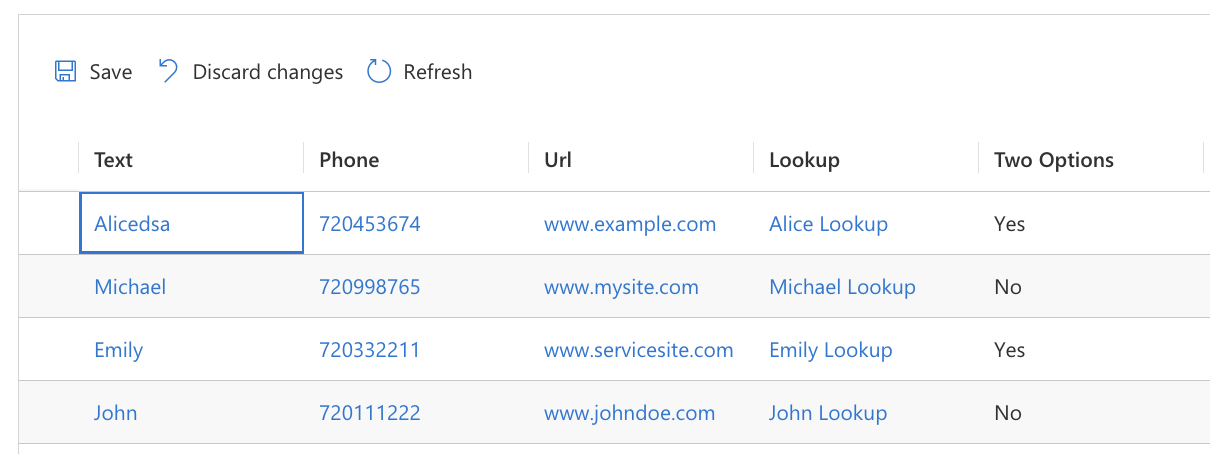
# Saving
The control supports manual and automatic saving. Manual saving uses ribbon buttons, while automatic saving can be enabled via the EnableAutoSave binding. With auto-save enabled, editable field modifications save immediately.
Use onBeforeRecordSaved and onAfterRecordSaved events in the Client API for custom logic. Modify saving behavior with the onRecordSave interceptor.
Provider behavior:
- FetchXml Provider: Saves changes directly to Dataverse
- Memory Provider: Updates the data source directly (retrievable via
dataset.getDataSource()after saving)
# Grouping and Aggregations
Group data by specific columns with value aggregation for each group using the grouping and aggregation properties in column definitions.
The grouping property requires the isGrouped boolean to enable column-based data grouping.
The aggregation property requires the aggregationFunction parameter. Available functions depend on column type and provider: countcolumn, count, min, max, sum, avg
Note: Using
aggregationwithout grouping creates a "Total row" at the bottom with aggregated values for all rows.
Pre-configured grouping and aggregations load automatically. Users can modify these through the control interface when enabled via EnableAggregation and EnableGrouping bindings.
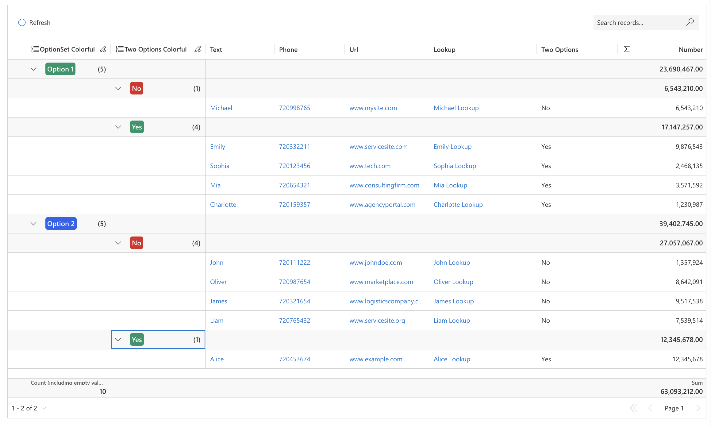 Grid grouped by two columns with aggregations
{
  "name": "category",
  "alias": "category",
  "dataType": "SingleLine.Text",
  "displayName": "Category",
  "order": 0,
  "visualSizeFactor": 150,
  "grouping": {
    "isGrouped": true
  }
},
{
  "name": "amount",
  "alias": "amount",
  "dataType": "Whole.None",
  "displayName": "Amount",
  "order": 1,
  "visualSizeFactor": 150,
  "aggregation": {
    "aggregationFunction": "sum"
  }
}
2
3
4
5
6
7
8
9
10
11
12
13
14
15
16
17
18
19
20
21
22
Grouping and Aggregation definitions example
Restrict user customization of column groupings and aggregations using the SupportedAggregations and CanBeGrouped metadata properties.
Note: These settings only restrict UI customization. Grouping or aggregation defined in column definitions applies regardless of these restrictions.
{
  "name": "amount",
  "alias": "amount",
  "dataType": "Whole.None",
  "displayName": "Amount",
  "order": 0,
  "visualSizeFactor": 150,
  "metadata": {
    "CanBeGrouped": false,
    "SupportedAggregations": ["sum", "avg"]
  }
}
2
3
4
5
6
7
8
9
10
11
12
Restricting aggregations and groupings for Amount column
# Limitations
- Date columns support grouping by specific date values only. Time period grouping (month, year, etc.) is not supported.
- Nested grouping restricts selection to groups without other grouped records for performance reasons.
# Ribbon
The control includes a built-in ribbon for grid refresh and change management (save/dismiss). Customize the ribbon through Client API.
 Grid ribbon
# Inline Ribbon
Display record-contextual buttons within each row by defining a special column named _talxis_gridRibbonButtons.
For custom buttons, include their IDs in the InlineRibbonButtonIds binding using comma-separated format: "button1Id,button2Id,button3Id".
When properly configured, the control renders ribbon buttons for each row.
{
  "name": "_talxis_gridRibbonButtons",
  "dataType": "SingleLine.Text",
  "visualSizeFactor": 300
}
2
3
4
5
Inline Ribbon Column Definition
The control renders ribbon buttons for each row when properly configured.
 Inline Ribbon
Inline ribbon buttons affect individual rows, while main ribbon buttons affect the entire dataset.
# Bindings Summary
| Property Name | Description | Of Type | Input | Output | Usage | Required |
|---|---|---|---|---|---|---|
| bindingField | Binding Field | SingleLine.Text | N/A | N/A | bound | true |
| DataProvider | Data Provider that the control will use to fetch data. | Enum ("Memory" | "FetchXml") | "FetchXml" | N/A | input | true |
| Data | Data Source depending on the provider (FetchXml for FetchXml Provider, JSON array for Memory Provider). | Multiple | "<fetch><entity name="account"><attribute name="name"/></entity></fetch>" | N/A | input | true |
| Columns | JSON array containing the column definitions. | Multiple | [{"name": "name", "isHidden": false}] | N/A | input | true |
| EntityMetadata | Optional property allowing you to override/define Entity Metadata | Multiple | {"DisplayCollectionName": "Custom Collection Name"} | N/A | input | false |
| Height | Can be used to force the control to always stay at fixed height. | SingleLine.Text | 500px | N/A | input | false |
| RowHeight | Sets a custom height for rows. | Whole.None | 42 | N/A | input | false |
| EnableEditing | Enable or disable editing functionality in the control. | Enum ("yes" | "no") | "yes" | N/A | input | false |
| EnableEditColumns | Enable or disable edit columns functionality in the control. | Enum ("yes" | "no") | "yes" | N/A | input | false |
| EnablePagination | Enable or disable pagination in the control. | Enum ("yes" | "no") | "yes" | N/A | input | false |
| EnableFiltering | Enable or disable filtering options in the control. | Enum ("yes" | "no") | "yes" | N/A | input | false |
| EnableSorting | Enable or disable sorting options in the control. | Enum ("yes" | "no") | "yes" | N/A | input | false |
| EnableNavigation | Enable or disable navigation options in the control. | Enum ("yes" | "no") | "yes" | N/A | input | false |
| EnableOptionSetColors | Enable or disable OptionSet colors in the control. | Enum ("yes" | "no") | "no" | N/A | input | false |
| SelectableRows | Defines if and how rows can be selected. | Enum ("none" | "single" | "multiple") | "single" | N/A | input | false |
| EnableQuickFind | Enable or disable the Quick Find feature in the control. | Enum ("yes" | "no") | "no" | N/A | input | false |
| EnablePageSizeSwitcher | Whether the user should be allowed to change number of rows per page. | Enum ("yes" | "no") | "yes" | N/A | input | false |
| EnableAggregation | Whether the user should be allowed to set aggregations on columns | Enum ("yes" | "no") | "yes" | N/A | input | false |
| EnableGrouping | Enable or disable grouping functionality in the control. | Enum ("yes" | "no") | "no" | N/A | input | false |
| EnableGroupedColumnsPinning | Enable or disable pinning of grouped columns in the control. | Enum ("yes" | "no") | "yes" | N/A | input | false |
| EnableCommandBar | Enable or disable the command bar in the control. | Enum ("yes" | "no") | "yes" | N/A | input | false |
| EnableAutoSave | Enable or disable automatic saving of changes in the control. | Enum ("yes" | "no") | "no" | N/A | input | false |
| EnableRecordCount | Enable or disable display of record count in the control. | Enum ("yes" | "no") | "yes" | N/A | input | false |
| EnableZebra | Enable or disable zebra striping (alternating row colors) in the control. | Enum ("yes" | "no") | "yes" | N/A | input | false |
| InlineRibbonButtonIds | Comma-separated list of inline ribbon button IDs to display in the control. | SingleLine.Text | N/A | N/A | input | false |
| DefaultExpandedGroupLevel | Default level of group expansion when grouping is enabled. | Whole.None | -1 | N/A | input | false |
| GroupingType | Defines the type of grouping to use when grouping is enabled. | Enum ("nested" | "flat") | "nested" | N/A | input | false |
| ClientApiWebresourceName | Name of the webresource containing client API functions for extended functionality. | SingleLine.Text | N/A | N/A | input | false |
| ClientApiFunctionName | Name of the client API function to call for extended functionality. | SingleLine.Text | N/A | N/A | input | false |
# Customization Options
Extended customization is available through:
Note: For local development and testing, use PCF local harness (opens new window) with the
_mockvariable set totrue.