Custom Command Bar Buttons
# Custom Command Bar Buttons
File Explorer control can be extended to support custom command bar buttons, which can trigger / cause some action.
# Configuration
These buttons can be added through configuration. First of all, make sure that you have a collaboration workspace template record created. This record is defining the features of an individual File Explorer control instance. Once that is sorted out, you can start adding buttons in the 🖱️ Custom Buttons tab.
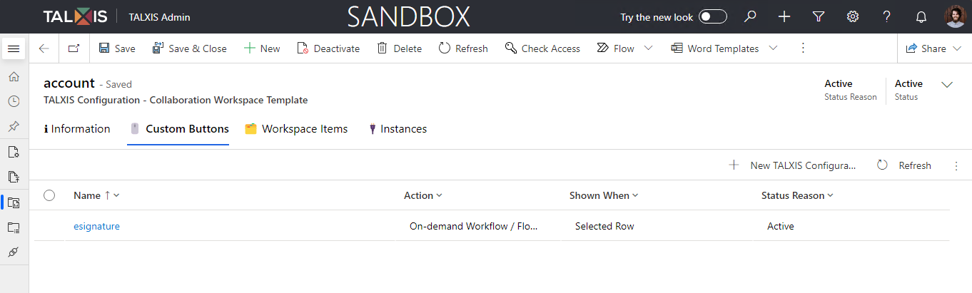
Here you add a new button (record) to the existing File Explorer control instance. These records can be then exported and versioned in the data package through pac tool cmt cli command, which opens Configuration Migration Tool on your local machine.
# Collaboration Workspace Custom Command Bar Button Record
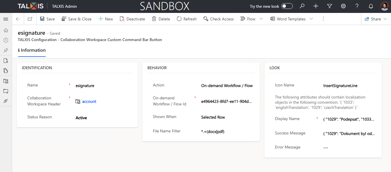
# IDENTIFICATION Section
| Attribute | Description |
|---|---|
| Name | Logical name of the button |
| Collaboration Workspace Header | Associated Collaboration Workspace Template. |
| Status Reason | Only Active records are retrieved and valid. |
# BEHAVIOR Section
| Attribute | Description |
|---|---|
| Action | Action that should happen once the button is clicked on. See available actions. |
| On-demand Workflow / Flow Id * | Id of the on-demand workflow or flow you wish to trigger. The triggering record is always the file you've triggered the action from. |
| Shown When | When should be the button shown to the user in the UI. See available values. |
| File Name Filter | Allows you to show the button only for a specific type of file. Example: *.* allows to select only files and not folders. There is minimatch (opens new window) library used for evaluation of these expressions. |
* : Visible only if the Action is set to On-demand Workflow / Flow value.
# Action Type Codes
| Name | Value | Description |
|---|---|---|
| On-demand Workflow / Flow | 742070000 | Triggers an on-demand workflow or cloud flow. This action can't be awaited. Fire and forget. |
If there is "your" action missing, feel free to extend this feature and implement it.
# Shown When Type Codes
| Name | Value | Description |
|---|---|---|
| Always | 742070000 | Show the button all the time. |
| Selected Row | 742070001 | Show only if one file or folder is selected. |
| Selected Rows | 742070002 | Show if multiple files are selected. |
| None | 742070003 | Show the button only if no file or folder is selected. |
# LOOK Section
| Attribute | Description |
|---|---|
| Icon Name | Name of the Fluent UI icon that you wish to use. The icons are referenced in PascalCase notation. You can use this resource (opens new window) to find the right icon. |
| Display Name * | Display name of the button. This text is shown in the UI to the end user. |
| Success Message * | Success message that is shown once the Action is completed. |
| Error Message * | Error message that is shown, when the Action could not be completed. |
* : Localized JSON objects can be used. These values are not known at design time and due to the localization requirement, this was the best value / effort solution. The object has string lcid (language codes) for properties with translated values. Example: { "1033": "This is the english localized value.", "1029": "Tohle je český překlad." }.