File Explorer
# File Explorer
# Visual example
# Description
Welcome to the documentation for our cutting-edge File Explorer control!
The File Explorer control is built on the foundations of the File Picker control. This means that you can find similar functionality, but it is essentially a much more powerful version of the File Picker.
# How to setup
# Binding Field
Control can be binded to any field of type Multiple (Multiline Text).
Example:
<controlDescription forControl="{af3dd624-3a7a-4a4a-bde6-68348df49a86}">
  <customControl id="{E0DECE4B-6FC8-4A8F-A065-082708572369}">
    <parameters>
      <datafieldname>talxis_filecontrol</datafieldname>
    </parameters>
  </customControl>
  <customControl formFactor="0" name="talxis_TALXIS.PCF.FileExplorer">
    <parameters>
      <bindingField type="Multiple">talxis_filecontrol</bindingField>
    </parameters>
  </customControl>
  <customControl formFactor="1" name="talxis_TALXIS.PCF.FileExplorer">
    <parameters>
      <bindingField type="Multiple">talxis_filecontrol</bindingField>
    </parameters>
  </customControl>
  <customControl formFactor="2" name="talxis_TALXIS.PCF.FileExplorer">
    <parameters>
      <bindingField type="Multiple">talxis_filecontrol</bindingField>
    </parameters>
  </customControl>
</controlDescription>
2
3
4
5
6
7
8
9
10
11
12
13
14
15
16
17
18
19
20
21
22
If you are accustomed to the File Picker setup, you might be surprised by the absence of certain parameters. They are not missing; rather, they have been relocated to the configuration record.
An existing Collaboration Workspace Template record is necessary for File Explorer to function correctly.
Check Collaboration Workspaces for more info.
# Authentication
If you are planning to use Microsoft Graph as a file source, you will need to provide consent for a few application registrations in order for this control to work. The whole authentication process is described here;
# General Overview
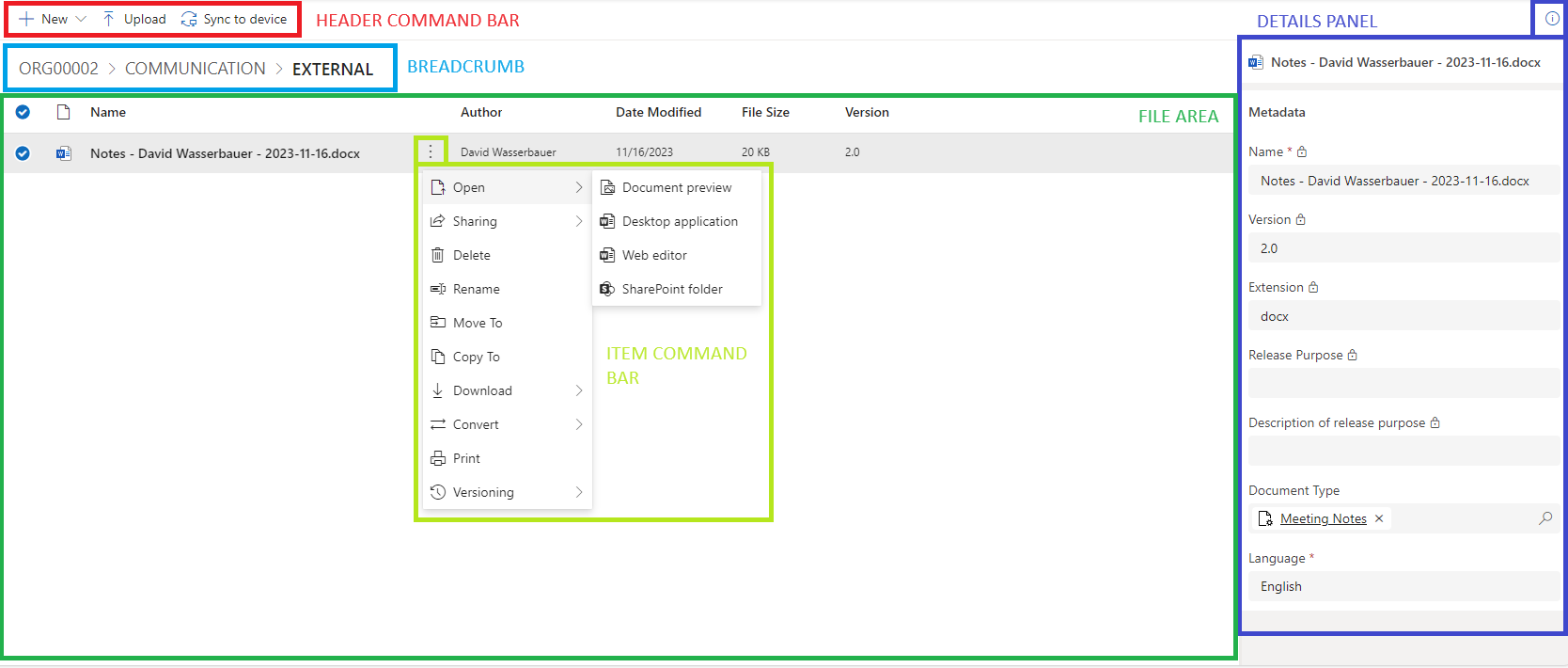
If we simplify the control then we have these general parts:
- Header Command Bar
- Breadcrumb
- File Area
- Item Command Bar (part of File Area)
- Details Panel
# Header Command Bar
This is a place for buttons which execute some actions. Those actions are done on selected items.
By default when nothing is selected or you have only one item selected it looks like this:

You can use these actions:
- New
- Upload
- Sync to device
If you have more than one item selected, the Item Command Bar next to the item name disappears, and buttons for supported actions appear in the Header Command Bar. It looks like this:
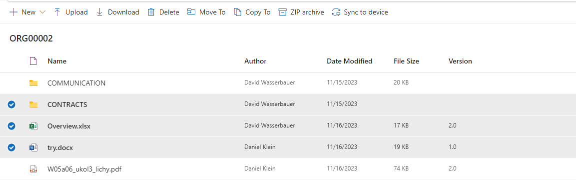
You can use these actions:
- New
- Upload
- Download
- Delete
- Move To
- Copy To
- ZIP Archive
- Sync to device
# Breadcrumb
This component is essentially a navigation property. By default, only the root folder's name is displayed (or the overridden name if applicable). If you navigate to a specific folder, you can return to the previous level by clicking on the corresponding folder in the breadcrumb path.

So for example in the screenshot above by clicking on "Contracts" you will go back to Contracts folder.
# File Area
The general appearance is similar to the File Picker control. You can select items, and by using Drag & Drop, you can upload new files. In addition to the existing features in the File Picker control, a new column is available to display the Version.
File names are clickable — a single click on a file name opens the file using the configured Default Opener. This is equivalent to using the Open action from the Item Command Bar.
# Version
The value is retrieved from SharePoint. Each time it is updated, the change is propagated to the connected talxis_file record where metadata is stored.
# Item Command Bar
Most of the command-related actions are executed through buttons. These buttons are filtered based on compatibility with the type of item. For example, folders have fewer options, such as Downloading as PDF, Printing, and Versioning.
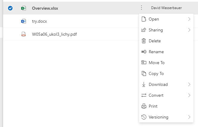
This is the full list on actions available there:
- Open
- Document Preview
- Desktop application
- Web Editor
- Sharepoint Folder
- Sharing
- Copy link
- Add people and send
- Delete
- Rename
- Move To
- Copy To
- Download
- File as is
- Convert
- ZIP archive
- Versioning
- Check Out/In
- Show history
# Details Panel
This is the area where you can view file metadata. By clicking on the "Info" icon in the upper right corner with the item selected, a panel will appear.
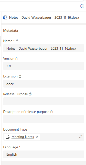
In this example the default talxis_file form is used. You can change this default form in Collaboration Workspace Template.
# What now?
Learn how to properly setup File Explorer via Collaboration Workspace Template.
Browse through capabilities of this control (WIP).
Check Document Templating to learn how to generate files from the File Explorer.
# Standalone Page
File Explorer can be used as a full-page standalone control (not embedded on a record form) by navigating to a page with pagetype=control. This is useful for deep-linking directly into a specific folder context from another part of the application.
The mandatory parameters are passed as a JSON-encoded data query parameter:
| Parameter | Description |
|---|---|
recordId | GUID of the record to use as the source context. Required. |
entityLogicalName | Logical name of the entity the record belongs to (e.g. account). Required. |
All other options (e.g. collaborationWorkspaceId, formId) follow the same conventions as when the control is used on a form — see Collaboration Workspaces and Document Templating.
Additionally, cmdbar=true&navbar=on must be set. The authentication broker JavaScript is loaded via the ribbon, so disabling the command bar will break authentication.
Example URL:
https://<org>.crm4.dynamics.com/main.aspx?pagetype=control&controlName=talxis_TALXIS.PCF.FileExplorer&cmdbar=true&navbar=on&forceUCI=1&data={"entityLogicalName":"account","recordId":"<guid>"}
Tips
When constructing this URL programmatically (e.g. in a sitemap or JavaScript), URL-encode the data value. Browsers encode it automatically when the URL is pasted into the address bar.