Grid


# Grid

Grid is a dataset PCF wrapper over Virtual Dataset. It allows you to use the same features that are available in the Virtual Dataset while enabling direct binding to a Subgrid or Homepage grid. This page only covers the differences between the Grid and Virtual Dataset controls. For more information about all the features available in Grid, please refer to the Virtual Dataset documentation.

Homepage Grid 
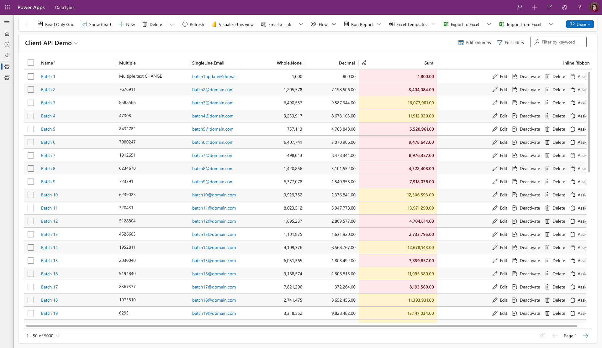
Grid control on Homepage Grid with Client API support.

# Usage

Since Grid can be directly bound to a Subgrid or Homepage grid, it does not require any additional configuration. You can simply add the Grid control to your form and bind it to the desired dataset. Of course, you can still use other parameters to customize the control's behavior the same way as you would with the Virtual Dataset control. Grid behaves the same as Virtual Dataset with FetchXmlDataProvider, so the behavior (for example in regards to the Columns binding) is identical.

The control can be bound to a Form via the Legacy Form Designer (Modern App Designer is not supported yet). For HomePage grid, please refer to this guide (opens new window)(relevant part starts from step 5).

# Client Extensibility

Grid control supports the same Client API as the Virtual Dataset control. However, the dataset instance is acquired a bit differently depending on whether the control is used on a Subgrid or Homepage grid.

# Subgrid

When the Grid control is used on a Subgrid, the dataset instance can be acquired similarly to the Virtual Dataset control:

function onFormLoad(executionContext) {
    const formContext = executionContext.getFormContext();
    const control = formContext.getControl('Subgrid');
    control.addOnOutputChange((executionContext) => {
        const control = executionContext.getFormContext().getControl('Subgrid');
        const dataset = control.getOutputs()['Subgrid.DatasetControl'].value;
        dataset.addEventListener('onRecordLoaded', (record) => {
            //register record expressions
        })
    })
}
1
2
3
4
5
6
7
8
9
10
11

# Homepage Grid

Getting the dataset instance in Homepage grid works a bit diffrently. Due to limited support for client scripts on Homepage grids, the dataset instance needs to be retrieved through a hidden ribbon button:

  1. Create a Homepage grid button with an Enable Rule that always returns false. Take a note of the button's ID.

  2. Assign a command to the button that will execute your custom JavaScript method. This method will be used to retrieve the dataset instance. Make sure to also pass PrimaryControl as the first parameter.

  3. Use the ribbon button ID as value for the Client API Ribbon Button Id parameter.

  4. If you've done everything correctly, you can retrieve the dataset instance in your custom JavaScript method like this:

function onMainGridLoad(primaryControl) {
    const dataset = window.Xrm[`talxis_grid_${primaryControl.getGrid().pageId}`];
    dataset.addEventListener('onRecordLoaded', (record) => {
        //register record expressions
    })
}
1
2
3
4
5
6

# Inline Ribbon

Since the control is bound to a dataset, it can interact with Power Apps ribbon buttons. You are able to whitelist specific ribbon buttons to make them render for each row. This allows for scenarios with quicker UX, since the user can click the button directly without having to select the row first.

Homepage Grid Inline Ribbon

In order to enable this feature, you need to follow these steps:

  1. Make sure that a column named _talxis_gridRibbonButtons exists on the dataset. It can either be added via layoutXml, Columns binding or interceptor on columns.

  2. Input the button ID's you wisth to be visible in the Grid into the Inline Ribbon Button Ids parameter. The ID's should be separated by a comma. Whitelisting a button does not guarantee that Grid will render it. The button must also have an Enable Rule that evaluates to true in order to be rendered.

# Ribbon Cell Customizer

You can customize the inline ribbon cell the same way you would do with a regular cell through a PCF customizer. Once you have the customizer setup, you will receive the ribbon buttons in the RecordCommands parameter. You can then either create a fully custom UI or leverage the GridCellRenderer to adjust the default UI.

# Customizing the default UI

public updateView(context: ComponentFramework.Context<IInputs>): void {
    ReactDOM.render(React.createElement(GridCellRenderer, {
        context: context,
        parameters: context.parameters,
        onOverrideComponentProps(props) {
            return {...props,
                onGetRecordCommandsProps: (props) => {
                    return {
                        ...props,
                        commandBarProps: {
                            ...props.commandBarProps,
                            items: props.commandBarProps.items.map((item) => {
                                return {
                                    ...item,
                                    iconProps: {},
                                    className: mergeStyles({
                                        '.ms-Button-label': {
                                            fontWeight: 600
                                        }
                                    }),
                                    text: `${this._getEmojiFromString(item.text!)} ${item.text}`,
                                };
                            }),
                        }
                    }
                }
            }
        },
    }), this._container);
}
1
2
3
4
5
6
7
8
9
10
11
12
13
14
15
16
17
18
19
20
21
22
23
24
25
26
27
28
29
30

Custom Ribbon Native

# Fully Custom UI

public updateView(context: ComponentFramework.Context < IInputs > ): void {
  return ReactDOM.render(React.createElement(CustomButtons, {
    context: context,
    commands: context.parameters.RecordCommands.raw
  }), this._container)
}

export const CustomButtons = (props: ICustomButtonsProps) => {
  const { context, commands } = props;
  const theme = useControlTheme(context.fluentDesignLanguage);
  const styles = React.useMemo(() => getCustomButtonsStyles(context.mode.allocatedHeight), [context.mode.allocatedHeight]);
  return (
    <ThemeProvider className={styles.customButtonsRoot} theme={theme}>
      {commands.map((command) => {
        return (
          <PrimaryButton
            disabled={!command.canExecute}
            onClick={() => command.execute()}
            text={command.label}
          />
        );
      })}
    </ThemeProvider>
  );
};
1
2
3
4
5
6
7
8
9
10
11
12
13
14
15
16
17
18
19
20
21
22
23
24
25

Custom Ribbon Fully