Tag Picker
# Introduction
The Tag Picker component extends the Lookup component from the @talxis/base-controls library. It provides a lookup-like functionality but visually represents selected values as colored tags. Internally, it utilizes the talxis_tag and talxis_taginstance entities to manage relationships between tags and target records.
Get familiar with Tags feature to better understand the Tag Picker.
# Manifest
| Property Name | Type | Description |
|---|---|---|
| Binding | SingleLine.Text | Binding field. It is used for data exchange when Tag Picker is nested. |
| Allocated Height | Whole.None | |
| Entity Name | SingleLine.Text | Target entity name for filtering tag instances. |
| Record Id | SingleLine.Text | Target record id for filtering tag instances |
| Scope Entity Name | SingleLine.Text | Scoping entity name for filtering tags. |
| Scope Record Id | SingleLine.Text | Scoping record id for filtering tags. |
| Output Selected Tag Instances | Enum | Select yes to ouput data to binding field. |
| Compact Mode | Enum | Select yes to display pcf in compact mode. |
# Lookup Behavior Differences
Unlike a standard lookup, Tag Picker’s items are constructed from talxis_taginstance, which links talxis_tag with the target entity. The displayed name and color are retrieved from talxis_tag. When a tag is selected or removed, corresponding talxis_taginstance records are created or deleted. If a new tag is created directly via Tag Picker, both a talxis_tag and a talxis_taginstance record are generated.
# Data Handling with Dataverse
The TagPickerLogic class manages all interactions with Dataverse through the Web API.
Selected tag instances can be retrieved in two ways:
- Using retrieveMultipleRecords: Filtering is performed via the target entity, and talxis_tag is expanded to obtain the name and color.
- Using binding property in nested PCF: When embedded in grids, selected tag instances with expanded tags are passed according to a defined interface.
export interface IBindingTagInstance {
  talxis_taginstanceid: string;
  talxis_tagid: {
    talxis_tagid: string;
    talxis_name: string;
    talxis_color: string | undefined;
  }
}
1
2
3
4
5
6
7
8
# Nested PCF and Context Updates
When used as a nested PCF, the component exposes an update view method via CustomEvent on intial render. This enables updating the context dynamically. The event is dispatched on the div container pass in the PCF init method and bubbling up for you to catch it in parent PCF. Below is the event definition:
const event = new CustomEvent(
    'talxis_onPcfUpdateView',
    {
        detail: {
            pcfName: 'talxis_TALXIS.PCF.TagPicker',
            id: this._targetRecord.recordId,
            onPcfUpdateView: this._onPcfUpdateView.bind(this),
            context: this._context,
            bubbles: true,
        },
    }
);
2
3
4
5
6
7
8
9
10
11
12
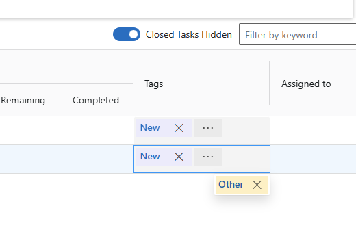
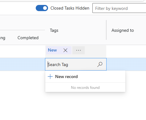
# Compact Mode
For grid implementations, compact mode is available. This mode:
- Displays only the selected tags initially.
- Hides tags when the input gains focus and replaces them with a search bar.
- Shows a single tag, hiding others under an expand button when multiple tags exist.